How I took a design system that had not received much love and upgraded it to help a university begin to scale online rapidly while developing a standardised experience.
I was brought into the Brand and Creative Services team at University of the Arts London to renovate the design system for their main website. An earlier design system had been created based on agency concepts, however, over time this had strayed from what was live on the site had discrepancies and components had been misappropriated due to a lack of written documentation.
The aim of revisiting the system was to update the components to what was capable in figma today, fixing issues that had been raised with the live site and refine the foundations so that the design system could push the visual logic of the brand, documenting a single source of truth which takes in both the design rationale and the accessibility.
Evaluating from the ground up
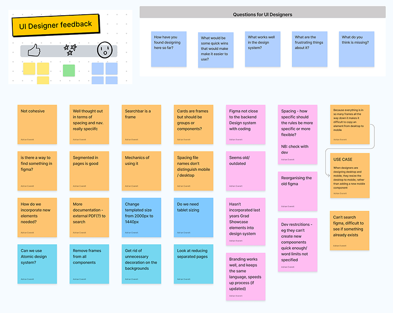
The discovery process began with a review of the existing site and the previous design files to work out where the two differed. The research process also involved seeing how assets were being used by the design team - almost all components were being detached and manually altered, making component design a key priority to centrally manage the design system in practice.
Refining the foundations
Academics love using really long words to write about art. This was something that hadn’t been fully factored into the heading sizes, resulting in broken words or disjointed titles. Stress testing changes to the typography to fix oversized headings from breaking mid-word.
Research gathered from the user survey identified that the spacing on the website was an issue, so I implemented a new scale for spacing, eliminating the XL size to reduce blank screen space, reducing scroll time and making content more cohesive.
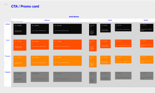
A stronger logic for colour uses allowed me to reduce the page themes from three to two, reducing the variants each component required. Colours were organised based on their function on the site, with a dark theme for university wide pages which was reversed for colleges. I also identified the shades in the palette that were used globally for the same function to avoid duplication in the themes.
Using atomic design principles
Atomic design principles were key to devising the component structure and creating durable components that can be updated quickly.
This was selected as the website has quite a limited selection of basic components, but combines these in a variety of ways to signify the section of the site it is located in.
A groundwork for continuous improvement
Updating the entire design system is a gargantuan task, so I prioritised work using analytics to select the page and templates with the most visitors over the last year. In kickoff workshops with other designers, we identified the components that needed updating for each template, reviewing the different implementations on the site. The selected components were set up as stories within the epic for each page template in Jira. These went in the project backlog until they were selected in sprint planning to move across the Kanban board.
The team
I was the main UI designer working on this project, but I certainly couldn’t have done this alone!
I worked with another UI designer whose main role was working on another UAL product, but his experience of working within the ecosystem was invaluable. I worked alongside the Head of Creative to QA component designs and refine the project roadmap to make sure it ran on track. As the system matured I also onboarded new designers when they started working with it.
The project also involved close work with the developers to ensure the work was handed over in the most efficient way for them and with content design to bring their expertise into stakeholder requirements for content across the site.